GRAPHIC ARTIST | CREATIVE DIRECTOR
Designing a Personal Logo for myself
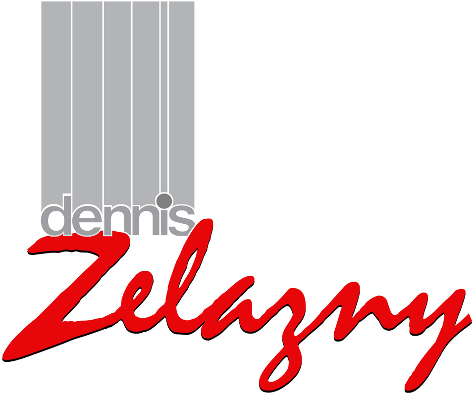
Creating a logo for myself was never a consideration. After over 30 years of doing it for others I decided to work a design up that I could use as a signature.
The process for this came to me in an unusual way. I had a dream about the how the dennis portion would look. How I could manipulate the letters into columns. The type face is helvetica, but it is the inside portion of 'Outline Helvetica'. This serves the conforming part of me and of course the Zelazny had to be bold and extreme my choice was another basic font "Mistral', which I altered to fit my needs.
The process for this came to me in an unusual way. I had a dream about the how the dennis portion would look. How I could manipulate the letters into columns. The type face is helvetica, but it is the inside portion of 'Outline Helvetica'. This serves the conforming part of me and of course the Zelazny had to be bold and extreme my choice was another basic font "Mistral', which I altered to fit my needs.
Logo Design for the Detroit Parrot Head Club
New Logo designed by Dennis Zelazny 2014
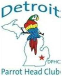 Original Logo
New Project:
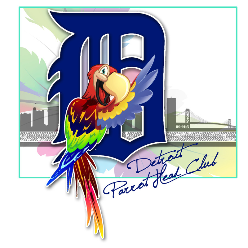
New Logo for The Detroit Parrot Head Club
The Detroit Parrot Head Club is the 5th oldest chapter of the PHIP and they are in their 21st year! The club is a Social and Community Group that plays a proud part in supporting local charities and local outreach.
I was called upon to give the logo a more polished look which incorporated the “D”, a very well know symbol of the city of Detroit.
I redesigned the Parrot with a more character look, and who looked friendlier.
The “D” is now his new perch, which stands tall over the City Skyline, which is sitting on, a tire tread. Detroit is known as the motor city and a tire tread is very symbolic of motoring.
For a splash of fun color I added the feathered background. The Font choice is a newer Typeface that is a bit whimsical, Jellyka Saint-Andrew’s Queen.
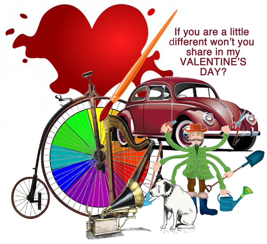
Showing a little love and creativity together
This little project was done for myself to my friends. It has many pieces to the puzzle, all representing myself.
Little Ads get noticed too!
Classified Advertising is just as important as the rest of the paper or any other media. Its also filled with eye catching ideas and thoughts. The following selection is a group of small sized ads that I created to be used as fillers for the Observer & Eccentric and Hometown Newspapers classified advertising sections. (Which I also assemble.)
When I set out to create these new pieces, I located interesting art and then wrote the copy to fit the space and the art. Theses ads need to be short on words and big on thought. You only have the readers attention for a split second. Tiny text will not work yet there is not enough space for a lot of copy. Words and art together make gold.
When I set out to create these new pieces, I located interesting art and then wrote the copy to fit the space and the art. Theses ads need to be short on words and big on thought. You only have the readers attention for a split second. Tiny text will not work yet there is not enough space for a lot of copy. Words and art together make gold.
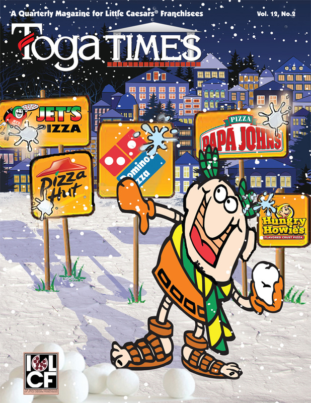
Magazine Cover Art
This is a quarterly magazine for Little Caesars® Franchisees that I produce. I get to have fun designing all the covers as well as assembling and coordinating the insides. The Cover art that I produce is very much like a single frame editorial cartoon. It always relates to a "Hot" topic of the season that the Franchisee owners are currently discussing. The topic is picked by the IOLCF group and from there I am set free to create.
Wine Label Design for private use
This was a fun project worth whining about. Bob's Pretty Good Print-Shop Wine is a private label made in Michigan with Michigan products. The labels were well received and are fun yet professional looking.